Prototyping a Wealth Platform
Role:
UX Designer, Researcher, UI Designer
User:
Clients with total net worth of $250,000 or more
Context:
Log into online banking to view total net worth of both internal and external accounts (including trust, investment, and brokerage accounts)
Business Goal:
Display content so that it is easy to understand, clear and concise without overwhelming user
User Goals:
-
Check balance of investment, trust accounts
-
View Realized Gain/Loss
-
View/sort/search transactions
-
View Investment allocation
-
View Top Holdings
-
View Market Value over time
-
View Net Cash Flow
-
View Statements for particular month
-
Add External Account
-
Contact Relationship Manager
Design Requirements:
-
Mobile-responsive
-
Meet accessibility guidelines
Methods:
-
Competitive Analysis
-
A/B Usability Test
Deliverable:
Interactive Prototype


Dashboard
Data visualization
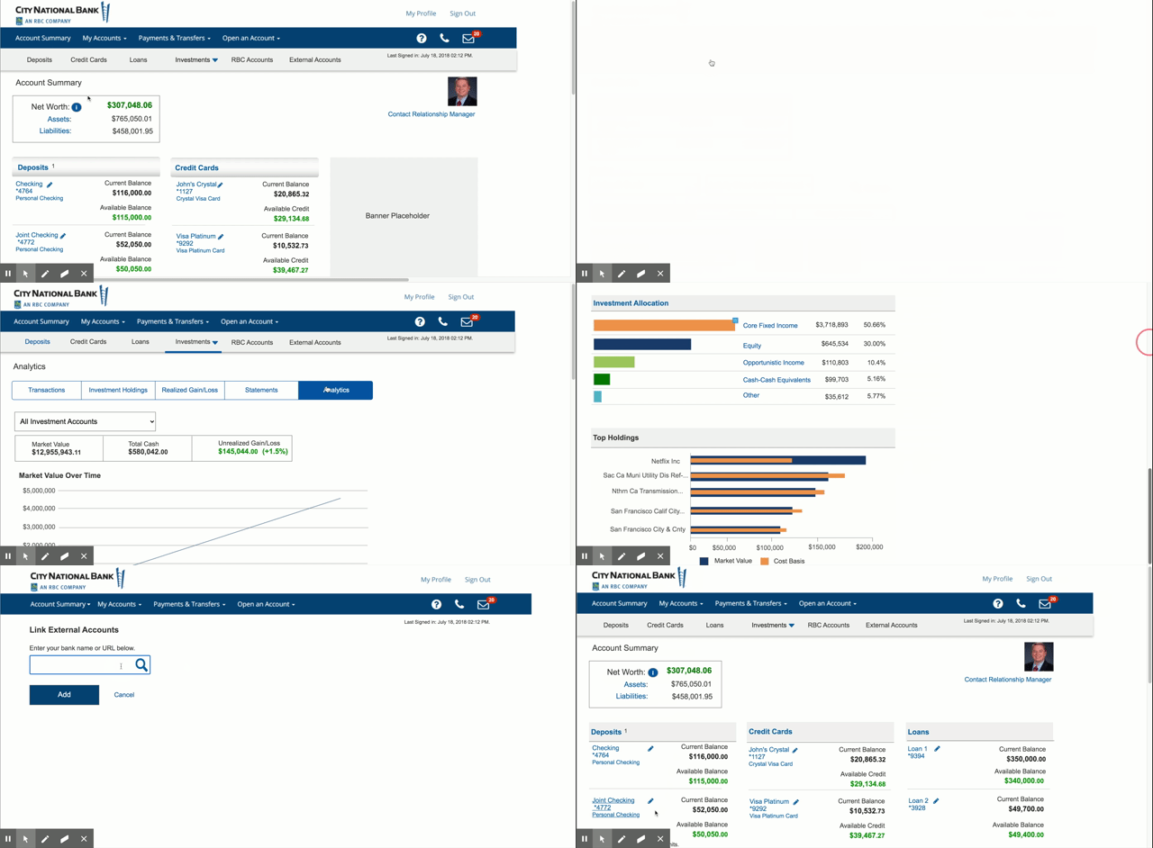
I chose to display data in bar graphs instead of a pie graph or donut chart which have usability problems.
Limitations of pie charts – difficult to visualize proportions
-
only recommended if have a maximum of 6 categories
-
not recommended if values are very similar
-
not recommended if values don’t add up to 100%
Instead I displayed data as bar charts as they are the simplest and most straightforward way to compare different values or show differences over time.


A/B Usability Test
Study Goal: Determine if second navigation menu necessary, general usability
Method:
Remote user testing
-
10 participants
-
Qualitative test
User Tasks:
-
First impression of layout on dashboard
-
Opinion of second navigation menu
-
View details of current assets
-
Navigate to Deposits screen
-
Navigate to Loans screen
-
Describe expected outcome of dropdown options
-
View account from another bank i.e. Bank of America
-
Describe difference between “Investments – Managed” and “Investments – Self-Directed”
-
Navigate to “Investments – Self-Directed” and describe if content matches expectations
Version A - with secondary navigation
I introduced a secondary navigation menu under the main navigation bar to easily switch between accounts.

Version B - without secondary navigation


Results
-
10 out of 10 liked second navigation menu
-
Most users liked clean layout, said it met their expectations